Adrian Frutiger – années de formation

Quelques notes sur la jeunesse et la formation d’Adrian Frutiger, selon le livre « Ein Leben für die Schrift », 2003, Schlaefli & Maurer AG, Interlaken.

Apprentissage à Interlaken : 1944–1948

À l’adolescence, Frutiger montre un grand intérêt pour le dessin. Ernst Eberhard, enseignant, le recommande à un ami imprimeur, ce qui permet à Frutiger d’y faire un apprentissage, dans un atelier d’imprimerie au plomb, l’imprimerie Schlaefli, entre 1944-1948 (de 16 a 20 ans). Dans les années de guerre, une grande quantité de tâches d’exécution est confiée aux apprentis, qui doivent maîtriser toute la chaîne de l’impression. Son patron lui permet l’inscription à un cours du soir en gravure sur bois.

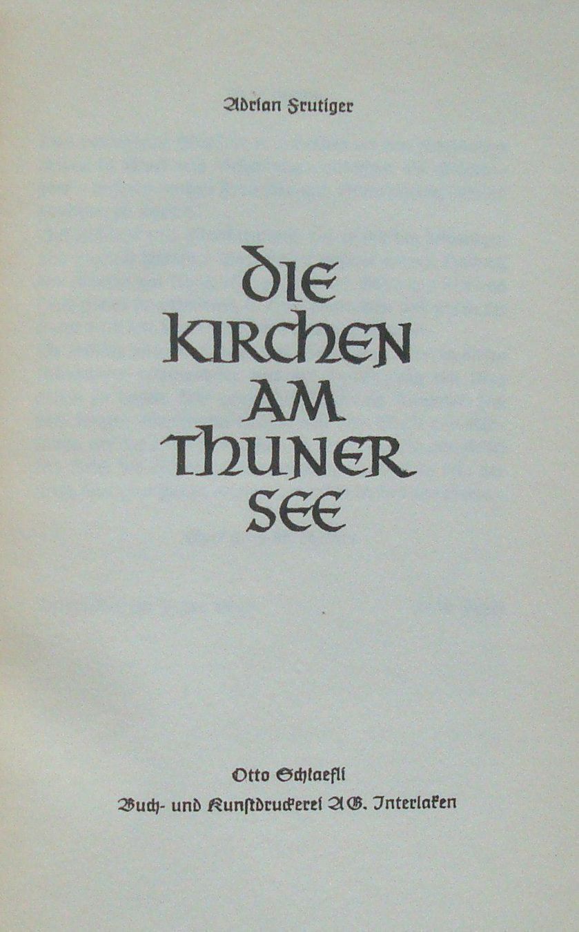
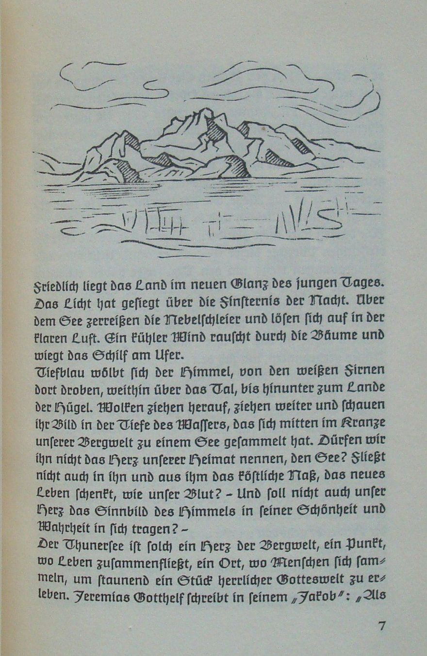
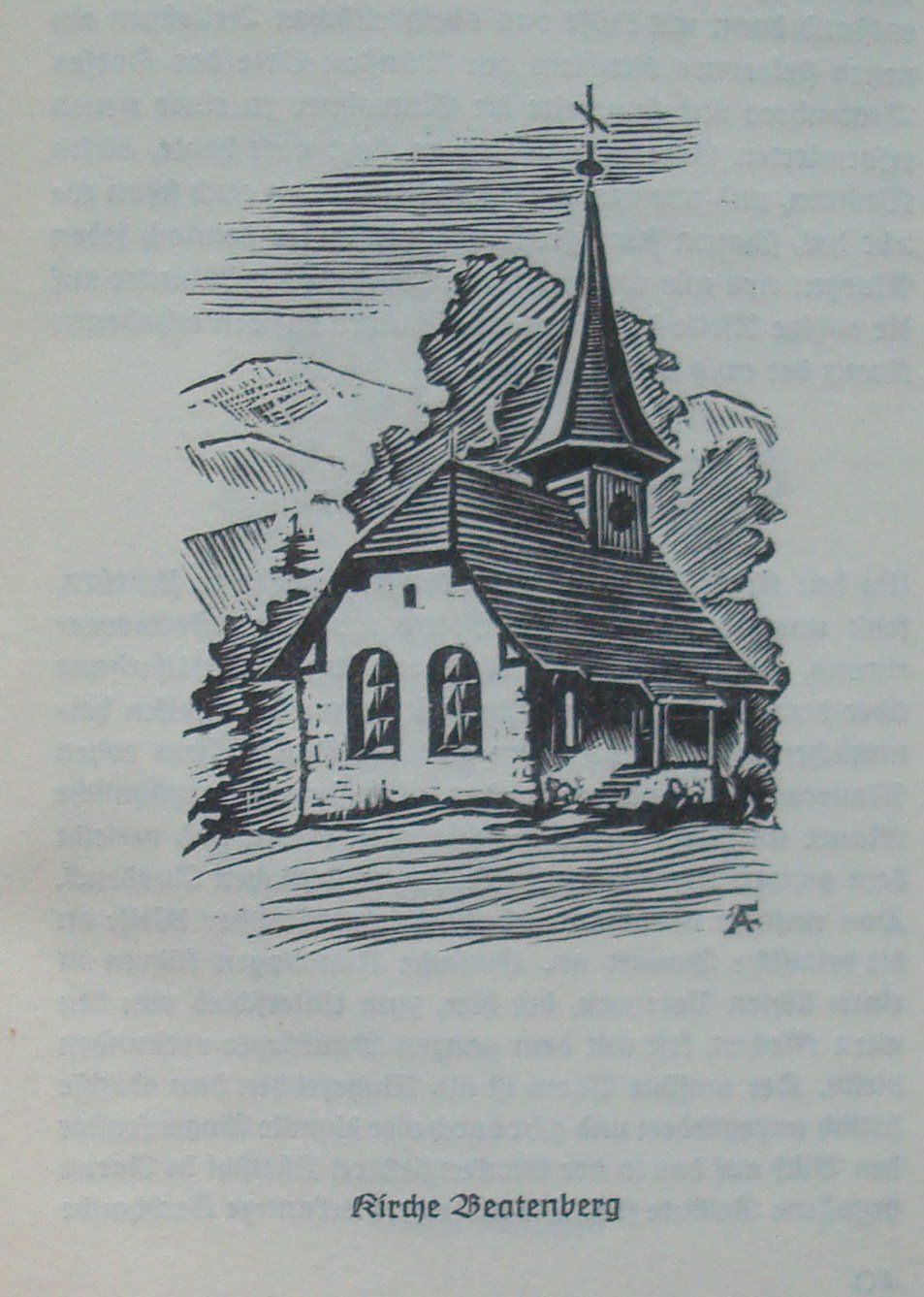
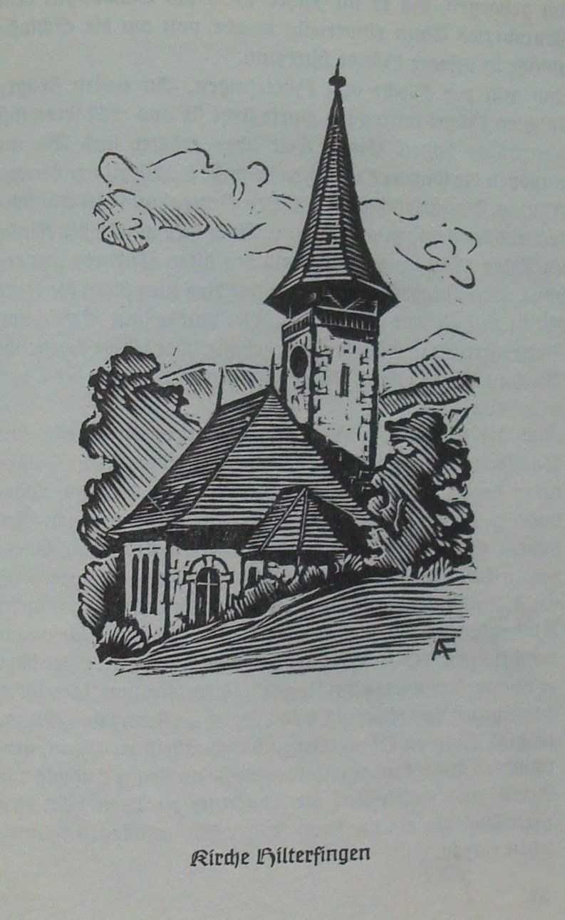
Dans son temps libre, Frutiger édite un petit livret « Die Kirchen am Thunersee »: un catalogue des anciennes églises autour du lac de Thoune. Il réalise les illustrations (gravures sur bois), rédige les textes et effectue la mise en page, dans une esthétique traditionnelle. Ce livret de 46 pages est édité en 1948 à 1000 exemplaires, pour honorer la fin d’apprentissage de Frutiger.

Etudes à Zurich : 1949–1951

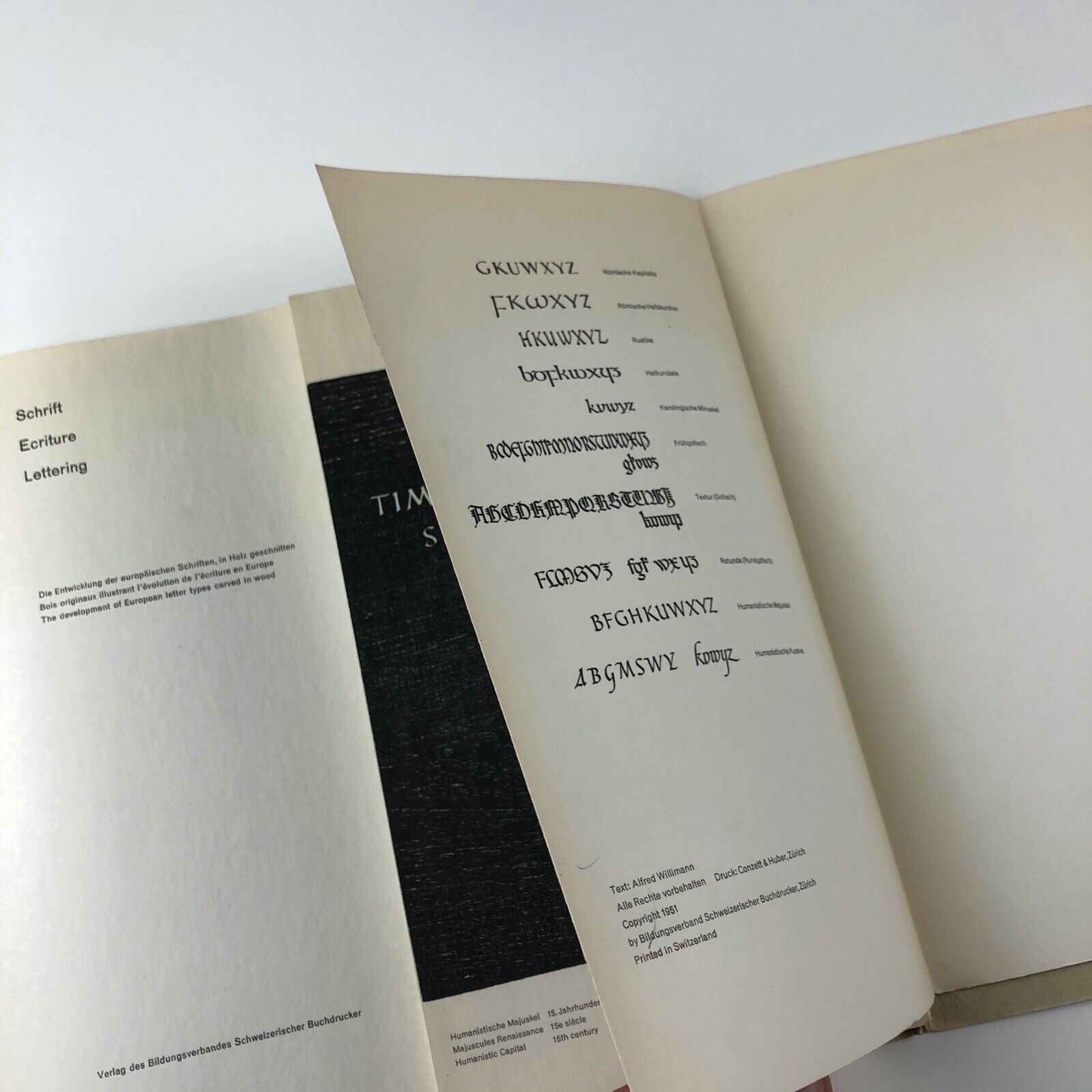
Son but professionnel est de devenir artiste peintre ou typographe. Pour rassembler l’argent nécessaire aux études, Frutiger est apprenti pendant une année (en 1948) comme compositeur typographe dans une imprimerie à Zurich (Gebr. Fretz AG). À la Kunstgewerbeschule Zurich, il s’inscrit dans la formation de concepteur de caractères (Schriftgestalter), de 1949 à 1951. Il est le troisième élève à suivre cette formation spécialisée, après Hans Eduard Meier (de 1943 à 1945) et Max Kämpf. L’enseignement comporte deux branches principales: la calligraphie (« Schriftschreiben ») auprès d’Alfred Willimann (quatre demi-journées), et le dessin de caractères (« Schriftzeichnen ») après de Walter Käch (une demi-journée). Les autres cours obligatoires comprennent « Dessin d’objet » et « Perspective. »

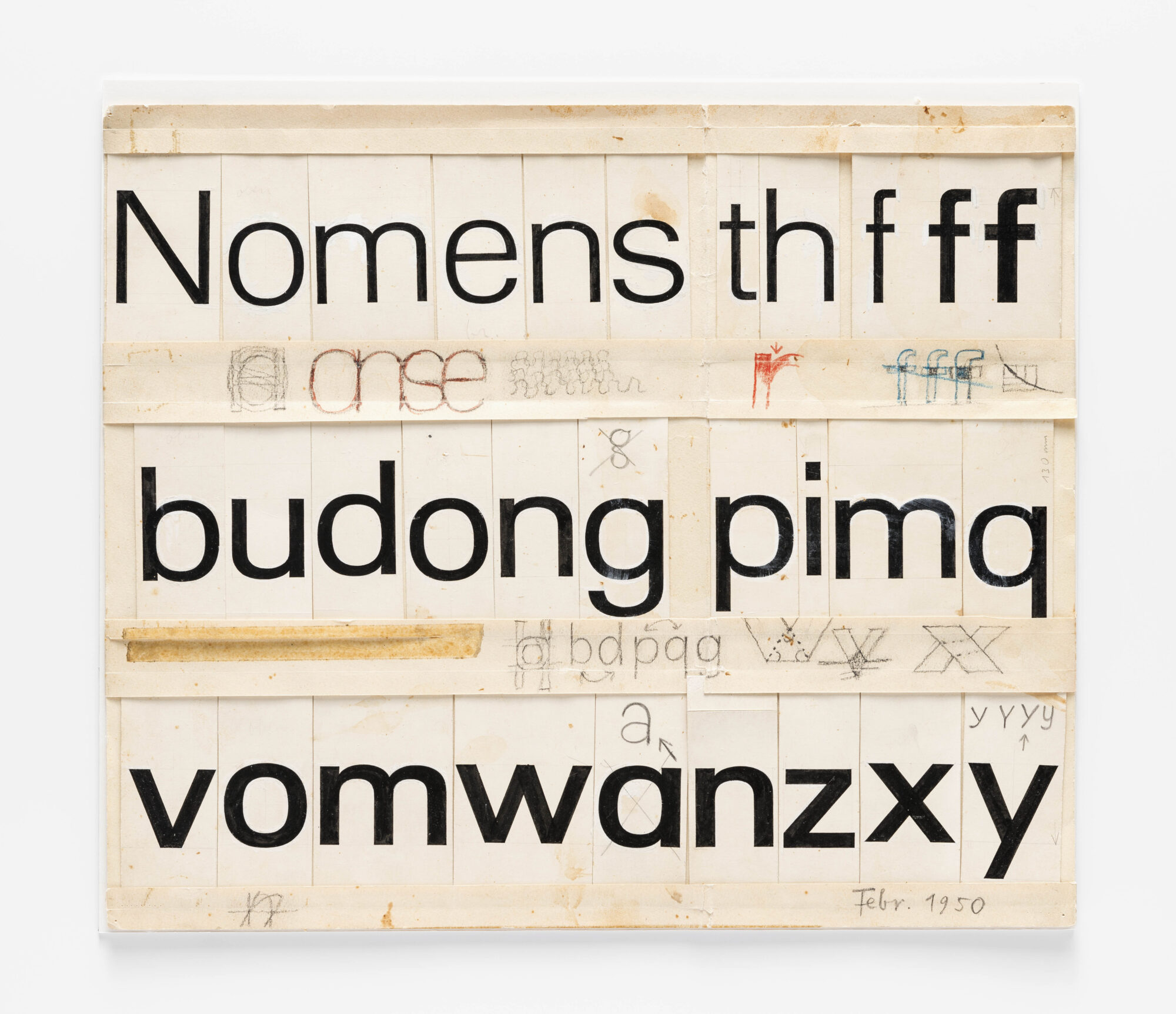
Walter Käch est un graphiste indépendant, formé par Ernst Keller, qui porte un intérêt particulier à l’étude des capitales romaines. Il visite des sites archéologiques en Italie pour produire des centaines de relevés d’inscriptions romaines. Il étudie minutieusement les proportions, l’épaisseur des traits, les courbes. C’est dans son cours que Frutiger a la vision d’une famille de grotesques, et développe les premières esquisses de ce qui deviendra Univers. Une esquisse datée de février 1951 est montrée dans le livre « Ein Leben für die Schrift » (p.23). On la trouve aussi sur le site eGuide du musée de design de Zurich.

Dans le cours de Willimann, Frutiger apprend l’évolution des écritures. Willimann enseigne comment la position de la plume influence le trait, décrit l’importance des espaces intérieurs et extérieurs, le rythme de l’écriture.

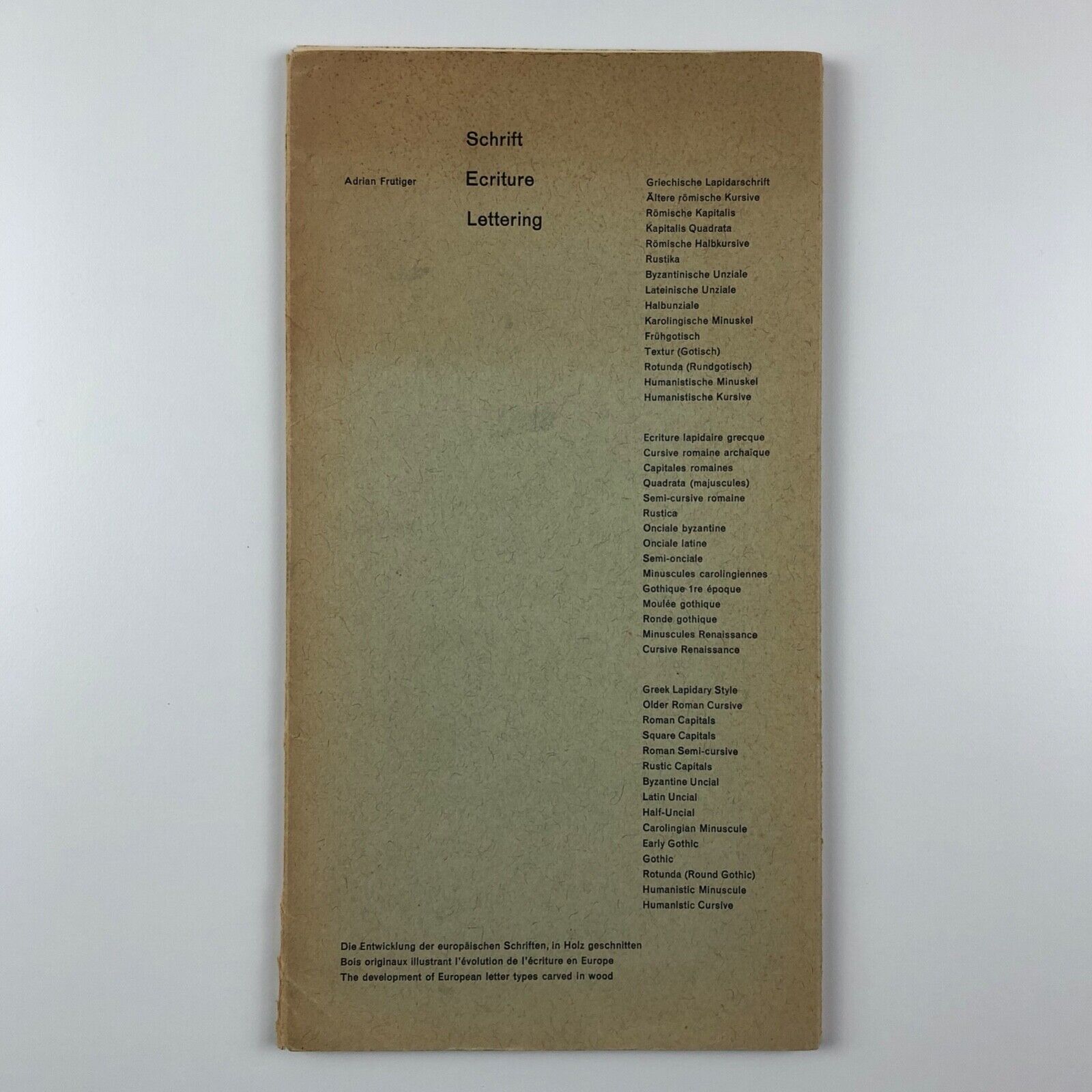
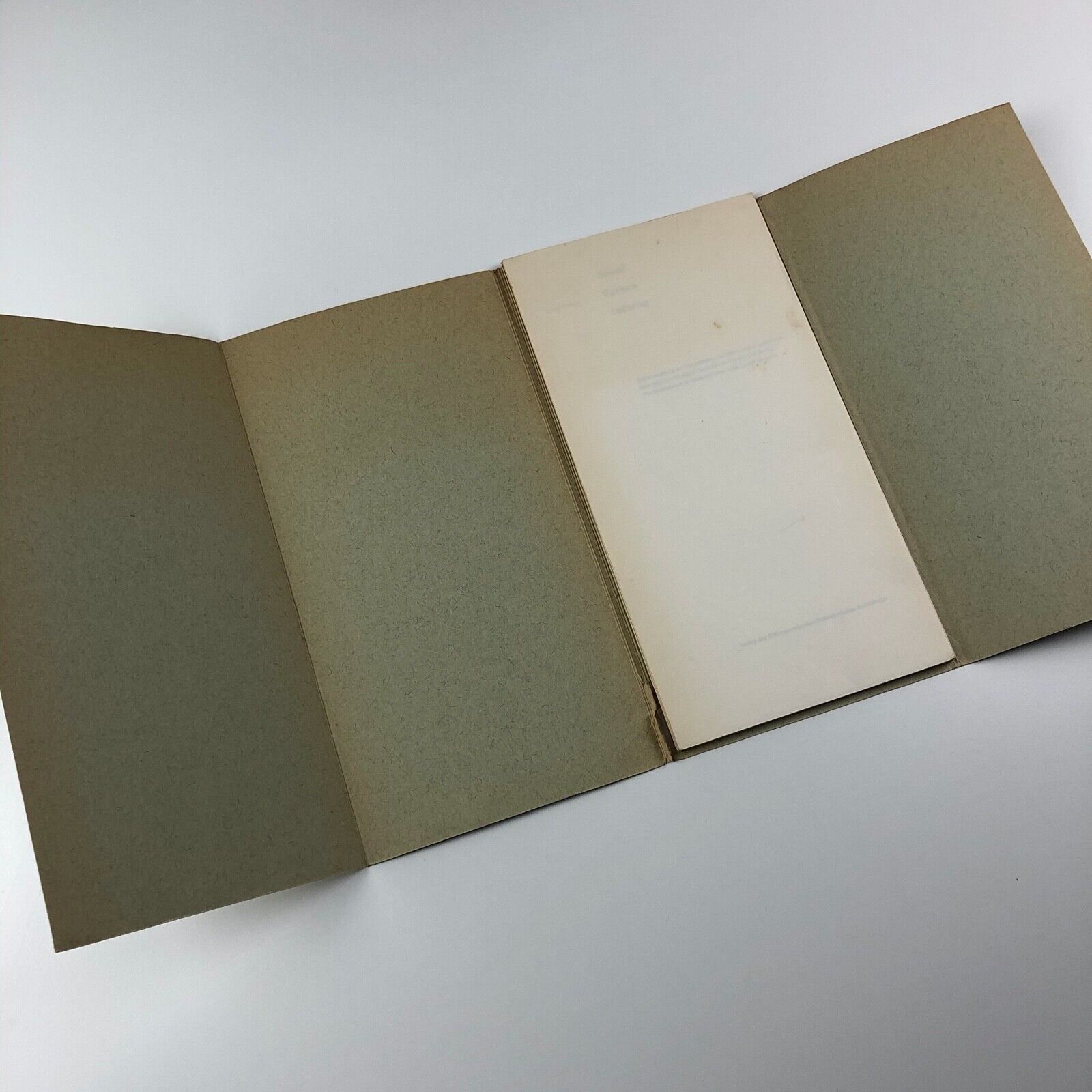
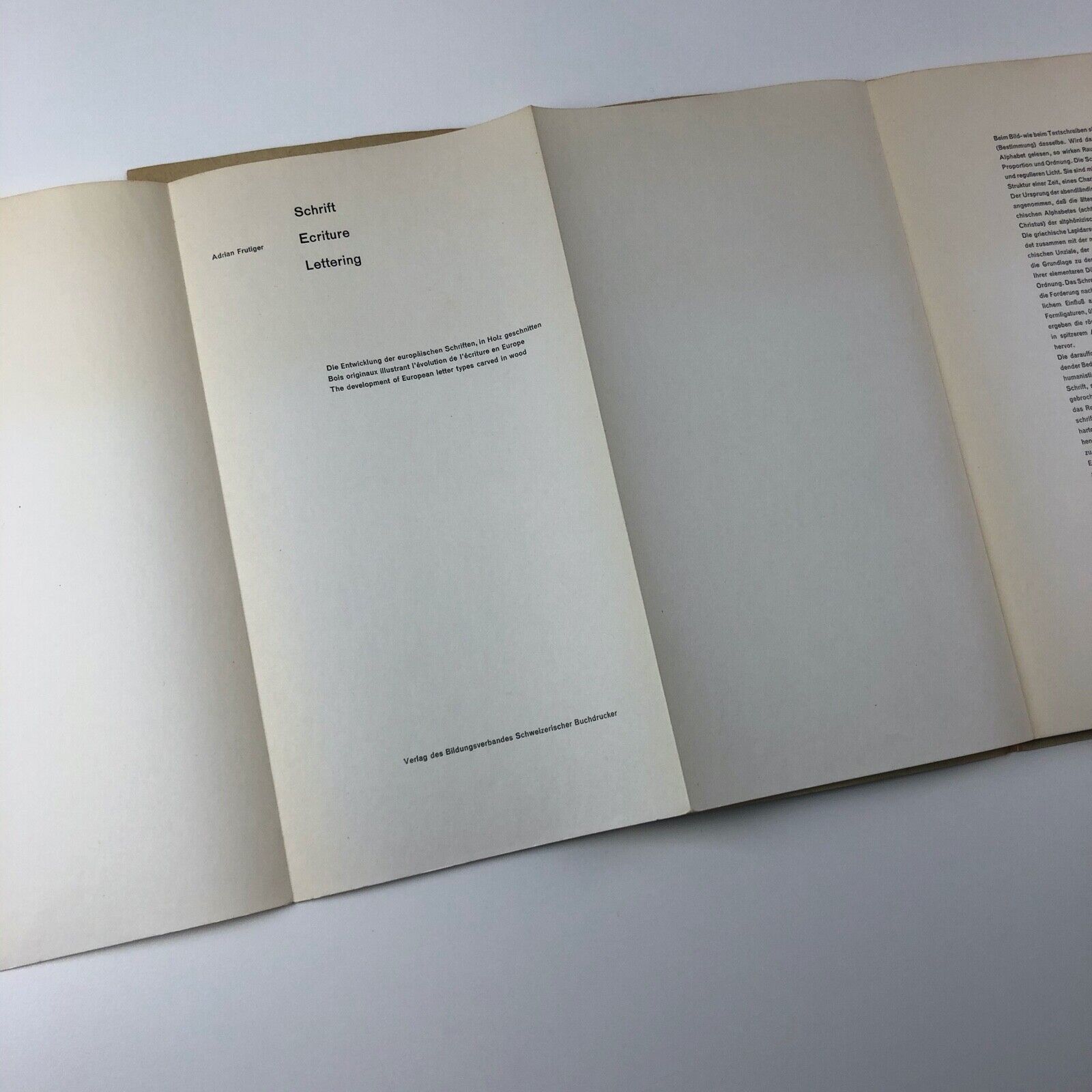
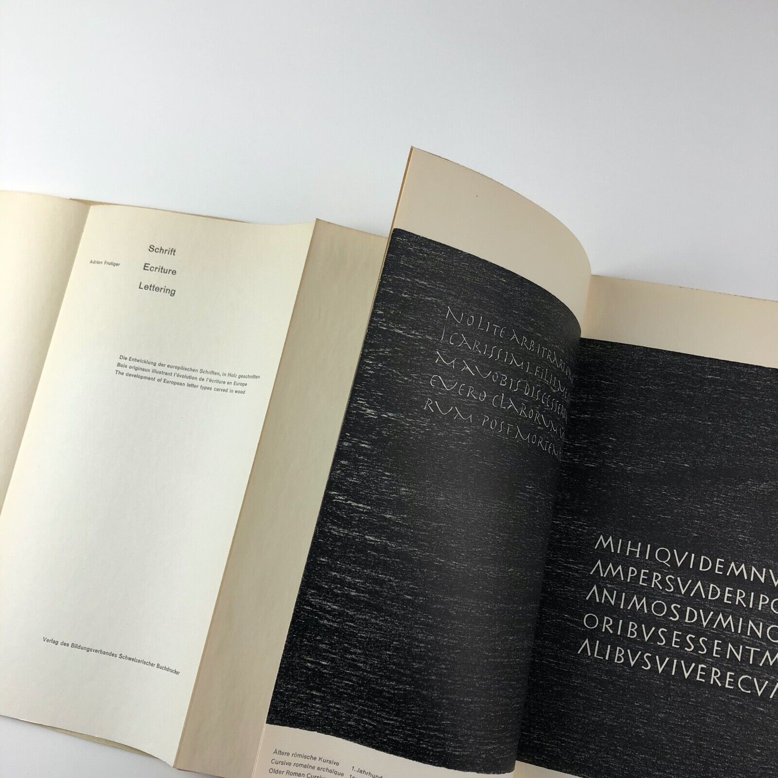
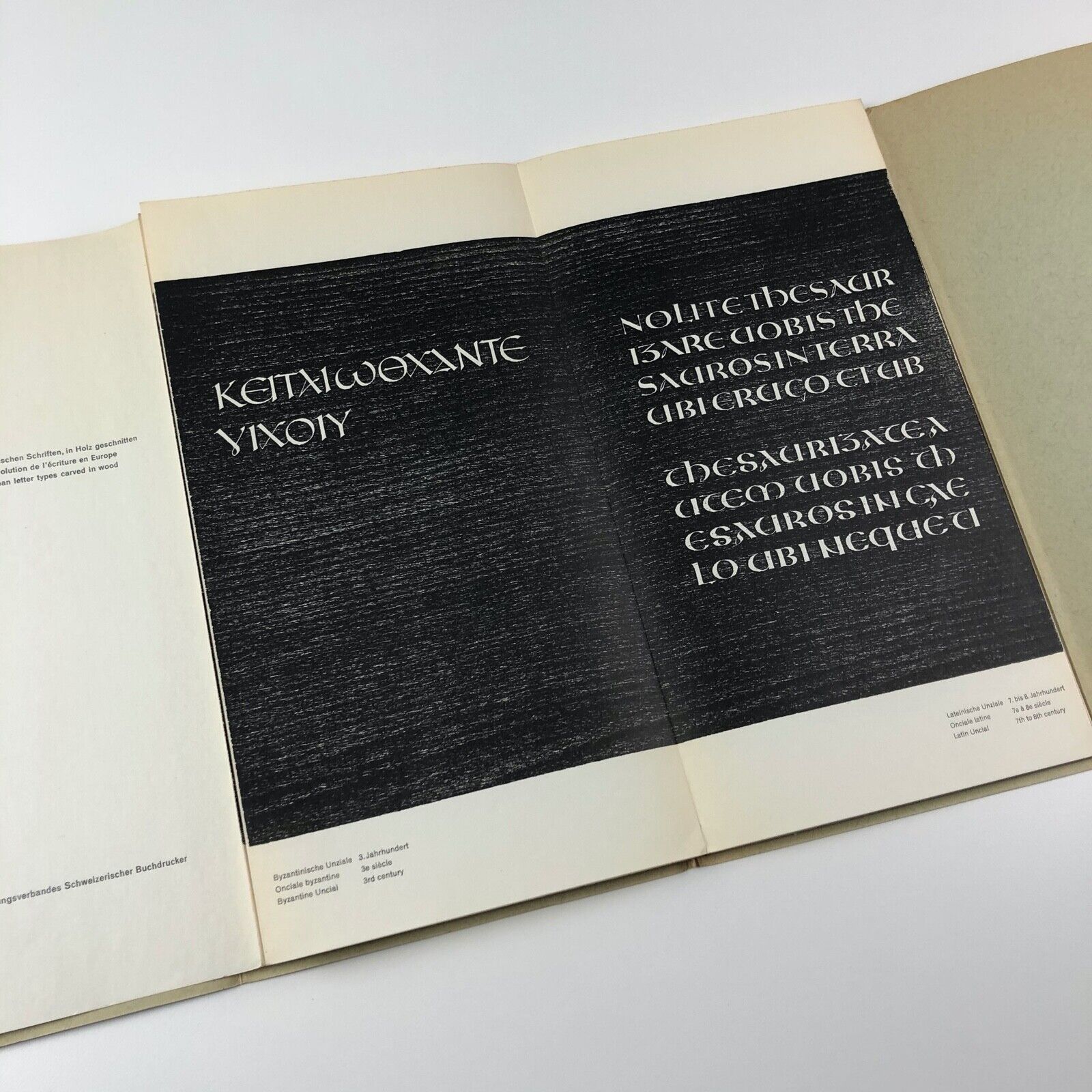
En 1951, Frutiger, âgé de 23 ans, réalise son travail de diplôme : « le développement de l’écriture occidentale, depuis le grec jusqu’à la minuscule humaniste ». Ne parvenant pas à produire des feuilles qui ne soient pas tâchées par ses doigts et exemptes de fautes d’orthographe, il décide de produire des planches imprimées. Il calligraphie l’écriture sur papier, puis la grave dans des planches de bois, pour aboutir à neuf plaques impeccables. Ce travail est édité en 1951 sous forme de leporello sous le titre « Schrift. Ecriture. Lettering. Bois originaux illustrant l’évolution de l’écriture en Europe », accompagné d’un texte d’Alfred Willimann.

Frutiger envoie une copie de son travail de diplôme à toutes les fonderies d’Allemagne et de France, dont la fonderie Deberny & Peignot. Charles Peignot l’invite à venir travailler dans son entreprise pour une année. Charles Peignot a acquis la licence pour la construction du Lumitype pour l’Europe, et prévoit de produire des caractères pour ce système. Frutiger déménage à Paris en 1952. Frutiger est alors âgé de 24 ans.

Media 77 , un nouveau caractère pour la photocomposition (dans TM-RSI)

En septembre 1977, le trio de designers typographiques opérant sous le nom Team’77 (Erich Gschwind, André Gürtler, Christian Mengelt) présentent dans les pages du magazine TM-RSI (Typogafische Monatsblätter / Revue suisse de l’Imprimerie, numéro 8/9.1977) un long article de 20 pages, présentant « un nouveau caractère pour la photocomposition ». Le caractère Media a été développé pour le système de photocomposition Eurocat de Bobst Graphic.

L’article décrit le processus de conception, qui commence par le développement de 5 variantes (A à E). Le même dessin de base doit couvrir la gamme des corps de 6 à 36.

Parmi les cinq propositions, deux variantes, C et E, sont retenues pour faire l’objet d’un développement approfondi (Projet 1 et Projet 2).

C’est la proposition 1 qui est retenue. S’ensuivent les étapes de dessin de l’alphabet, puis la déclinaison en différentes graisses (du light au bold) et largeurs (de narrow à extended).

L’article s’achève sur une forme de manifeste créatif signé par le trio (dont la force est quelque peu amoindrie dans la traduction française et anglaise, donc voici l’original):

Die Schriftform ist letztlich auch Ausdrucksform, und solange unser kreatives Bewusstsein Mitteilungen in bestimmte Formen kleiden möchte, so lange suchen wir immer wieder nach anderen, neuen formalen Ausdrucksmöglichkeiten in der Schrift.

Lien vers le scan de l’article (PDF, 19.7 Mo):

Bobst Graphic – Scrib

Quelques images du Scrib, produit par Bobst Graphic entre 1978 et 1981. Sorti en 1978, c’est un appareil de « télérédaction » de la taille d’une machine à écrire, destiné aux journalistes. Doté d’un coupleur acoustique, ce « précurseur de l’ordinateur personnel » peut être connecté à un téléphone pour transmettre des textes « à la vitesse de 3000 bits par seconde ».

Source: Gilliane Cachin et François Rappo, Bobst Graphic, 1972-1981, 2019 (ISBN 978-3-03863-041-8).

Voir aussi l’article Wikipédia: Bobst Graphic.

Femmes compositrices typographes

Citation de Roger Chatelain, historien de la typographie et typographe, dans « Bobst Graphic » (en conversation avec François Rappo, p.23):

En ce qui concerne la présence des femmes dans l’imprimerie, voici quelques repères. 1923: le syndicat obtient des patrons d’imprimerie qu’aucune femme ne sera engagée (à noter que [l’imprimerie] Saint-Paul – Fribourg constitue une exception, puisque des sœurs travaillent dans les ateliers). 1960: les filles de patrons d’imprimerie et de compositeurs sont autorisées à effectuer l’apprentissage de compositrice typographe. 1968: Anne-Marie Roy, fille de typographe, obtient son CFC de compositrice (ERT). 1975: les sœurs de Saint-Paul sont autorisées officiellement à effectuer l’apprentissage de typographe. 1984: à l’ERAG, Nicole Messelier obtient le CFC de conductrice typo-offset (c’est la première de Suisse).

Dan Boyarski on the Basel design education

A short transcript from a recollection by Dan Boyarski on the teaching experience in Basel.

Dan Boyarski studied in Basel for two years, in the Advanced Program for Graphic Design, from 1977 to 1979. He was 30 years old, and had already 5 years of teaching experience. This his how he describes the outcome :

I thought for 10 years in Louisville, followed by 35 years of teaching at Carnegie Mellon University, in Pittsburg.
Teaching both undergraduate and graduate students, and working with my faculty colleagues, and shaping design programs that responded to changes, in the field, in society, and in the world.
Technical changes, societal changes, environmental changes.

With my students, we explored the shift from communicating on paper to communicating on a screen.

Similarities and differences we explored between static information and dynamic information.

Between the written word, spoken word and moving word on a screen.

We designed posters about sustainability, websites about health care, and apps with maps for safe biking in the city.

I realize that the most valuable lesson from studying with Hofmann and the other teachers was developing an attitude about design.
Seeing, exploring with the mind, the eye, the hand.
Systematic thinking, through sketching, balanced by intuitive bursts of play.
And then the careful crafting of final solutions.

Each teacher thought in their own way, but were united in that basic approach to visual and conceptual exploration.

Source, on Vimeo:

Inge Druckrey on Yale

Short transcript of Inge Druckrey on the design education in the US (during round-table discussion in October 2020, online symposium at the FHNW Academy of Art and Design Basel):

In the US, in the mid 1960, there was still a strong emphasis on advertising rather than design.

A true graphic design program existed only at Yale, with Alvin Eisenman, Norman Ives, Josef Albers, Herbert Matter, Alvin Lustig.

It was at Yale that Herbert Matter, with his students, did the corporate identity for the New Haven Railroad.

There were a few other centers trying to build a consciousness of graphic design. Among them, the Aspen Design conferences, and the Design Quarterly of the Walker Art Center in Minneapolis. The first design magazine was edited there by Mildred Friedman.

Rob Roy Kelly, chair of the Kansas City Art Institute, was educated at Yale, and very influenced by Alvin Lustig and Josef Albers. He was aware and impressed by Armin Hofmann’s work and teaching.

I was hired to teach not only the students, but also him and the other faculty, about my education in Basel. So I had full support by faculty and students, who were very open and eager to learn.

Source, on Vimeo:

Kenneth Hiebert on the Basel education

In October 2020, to celebrate the 100rd anniversary of Armin Hofmann, a two-day online symposium took place at the FHNW Academy of Art and Design Basel.

Kenneth Hiebert was one of the participants in a roundtable discussion, moderated by Sandra Bischler, titled « The Pedagogical Dimension ».

During the discussion, Hiebert reflects on his experience as a student under Armin Hofmann, 1959-1964.

The Basel education characteristics that I treasure:

Silence.

Reflection.

A conducive class environment.

There was no horsing around.

Each project was built on a previous.

All work was in the studio.

No all-nighters.

We learned the visual language universals:

Syntax.

Having meaning.

Building relationships between forms and space.

Seeing constraints as openings rather than obstacles.

On vimeo:

Kenneth Hiebert, biographie

Kenneth Hiebert suit la formation de graphisme (Fachklasse für Grafik) dirigée par Hofmann entre 1959-1964. Dès 1966, il contribue à développer le programme de design graphique au Philadelphia College of Art, alors dirigé (de 1964 à 1974) par Rob Roy Kelly. Il y enseigne jusqu’en 1999.

D’autres alumni de Bâle qui y enseignent sont Inge Druckrey (de 1971 à 1973), April Greiman, encouragée par Hofmann (de 1971 à 1976), et Christa Zelinski (de 1977 à 2007).

Selon Sadha (2013):

He taught briefly at the School of Design, Basel, then at Carnegie Institute of Technology, and from 1966–1999 at what is now The University of the Arts where he was founding chairman of the graphic design department. He retired Professor Emeritus in May 1999. 

He instigated the universal/Unique symposium and invitational exhibition at the University of the Arts in 1988. He received the Mary Lou Beitzel Award for Distinguished Teaching in 1990 and the Master Teacher Award of the national Graphic Design Education Association in 1991. Honorary degrees were awarded by the Maine College of Art in 2002 and the University of the Arts in 2013.

Quelques indications biographiques:

Hiebert pioneered the program of graphic design at the University of the Arts in Philadelphia, formerly the Philadelphia College of the Arts.

He was visiting faculty at Yale University and Carnegie Mellon.

Publications

Hiebert is the author of two books:

  • Graphic Design Processes (Van Nostrand Reinhold, 1992)
  • Graphic Design Sources (Yale University Press, 1998)

In 2019, the Cary Graphic Design Archive at Rochester Institute of Technology acquired the work of Ken Hiebert, making it « available to scholars and students interested in the Swiss influence on American graphic design » (Gawlowicz).

Sources:

Postmodern Typography (1977)

A very early application of the architectural term postmodern to graphic design was the title of a 1977 Chicago exhibition curated by Bill Bonnell: Postmodern Typography: Recent American Developments.

Ironically, the exhibition included works by Steff Geissbuhler, April Greiman, Dan Friedman, and Willi Kunz – all of whom had come to America after works or study in Switzerland.

Meggs’ History of Graphic Design, p.501